Bilal Chahal
Lebanon 1978


Chronos & Kairos 2024
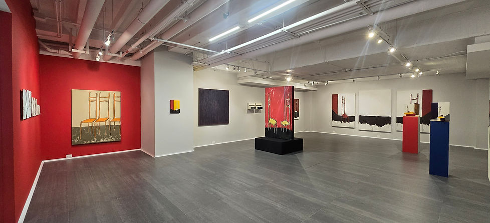
Chronos & Kairos, the duality of waiting. In his Chronos and Kairos series, Chahal materializes the duality of time inthe recurring shape of an uneven, elongated chair. Going against theconvention of time representation associated with time-measuring devicessuch as calendars or clocks, a chair appears as a stand-in for waiting, reunion,tension, and meaning. Distorted by their uncertain state in space and time,these painterly chairs are both precise and elusive, elastic and finite,painfully slow and vanishingly fleeting. The composite nature of time is also conveyed through the materialaggregations on the pictorial surface. The spontaneous and fluid strokes thatdefine these chairs conceal the thick, multilayered strata of paper andpigment blending beneath: a unique and demanding process that takes weeksto complete. A crucial characteristic of Chahal’s entire oeuvre, the dense yetporous patina that permeates the chromatic tones beneath resembles primaltextures like ceramic or soil while retaining its lightness. The materiality of hisdrawings is also a temporal paradox, as these are made by tearing apart,painting over, and blending together earlier works by Chahal himself, withforgotten imagery reborn as a fresh surface for a new, spontaneous work to emerge. The obsessive, iterative, and haunting scene that unfolds across differentscales reiterates the importance of reading time through the polarity andcomplementarity of Chronos and Kairos. On one hand, an atmosphere frozenin time alludes to an introspective state of eternal waiting, detached fromdaily occurrences. On the other hand, the hasty sketch reminds us of physicalspace where chronological time continues to slip through, constant andsilent, indifferent to age, will, and angst. This visual and material research is grounded in linguistics and history.Although we currently use the Latin root tempus, it is in Greek etymology thatthe duality of time can be grasped. Chronos defines quantitative time: whatcan be measured and partitioned, what rules our daily lives in the shape ofschedules and time slots. Sequential and indifferent, it refers to the passiveand neutral background on top of which life takes place. Kairos, connected tothe god of luck and opportunity, refers to a decisive instant or critical time: aqualitative dimension that focuses on meaningful episodes or purposefulevents. It is strongly related to the subjective perception of time, wheremood and attention warp the length and duration of experiences. Chahalchallenges both definitions of time and plays with their boundaries,developing an in-between state that permeates his canvas, working method,and artistic approach. curated and texst by Juaniko Moreno 2025
Ambivalenties in Red 2023
.jpg)
Ambivalencias en rojo (Ambivalences in red in English) is a series of monochrome paintings in which Chahal, as in previous proposals, works with a mixed technique around the same color, with his own mixture of materials that allows him to explore different textures through layers that overlap in various ways, always starting with dark layers that allow the lightest ones to gain intensity and expressiveness. The red, however, caused an additional urgency: that of the darkness struggling to get out. This resulted in small adjacent pieces, which reveal the dark background, like a window that demands to be opened. The nature of red could have caused this sprain. Perhaps like no other, red is the color of ambivalence: the life that runs through the veins driven by the heart, and that same blood that, when spilled, is a sign of death. This relationship with life and death is what has made red a primordial color in so many cultures: the original, not as what did not previously exist, but as the origin of everything else, what we come from and to which, at the end of it all, we will probably return. Artistic creation puts before our eyes -those of the artist, but also those of who contemplate his work-, what is difficult to see: those dark layers that underlie and pre-exist everything else. As Chevalier and Gheerbrant point out, the color red "is secret, it is the vital mystery hidden at the bottom of the darkness and the primordial oceans." In the Celtic tradition, this color is associated with warrior druids, that is, spiritual warriors. In a certain way, red embodies the war against itself, against the layers that we put, one on top of the other, to hide from ourselves. The warrior archetype embodies ambivalence like no other: the warrior is the one who faces death from his love for life. It is the red of the earth with which the vessel is molded: a container for food, but also for the ashes that remain as traces of our passage on earth. Owner of a body of work as intense as it is abstract, Chahal has avoided, until now, making direct connections with his personal experience. However, he has not managed to get out of the red unscathed. A series of windows have finally been opened to his childhood, in the midst of the war in Lebanon, and to his adolescence, in confrontation with a tradition from which he cannot escape, but from which, at the same time, he had to escape. In the overlapping of these layers in red, he has found a question about what he refuses to look at in the face, not out of fear or shame, but because, in his ambivalence, he does not allow himself to be fully grasped, he does not allow judgment or judgmental assertion. The windows have been opened. curated and text by Liliana Moreno Acevedo, 2023
Emotional Abuse 2022
.jpg)
Emotional Abuse is a public-space art installation by Lebanese-Dutch artist Bilal Chahal, presented in front of MAMBO. The work brings visibility to an issue that is usually dealt with privately: the subtle ways in which emotional abuse manifests itself.Chahal seeks to bring into the public realm the subtle ways in which love and affection, under conditions of manipulation, can gradually transform into anxiety and trauma. The varying sizes of the spheres symbolise the different forms and degrees of trauma that individuals may experience, while porcelain the delicate material from which they are made reflects on human fragility. Emotional Abuse consists of 25 glazed ceramic spheres positioned at different heights. Some of the pieces have been broken and reassembled, with the adhesive deliberately left visible. These fractures and repairs refer to the internal scars that traumatic emotional experiences can leave behind.Each sphere is inscribed with phrases referring to patterns of manipulation and emotional abuse. The sentences spiral upwards, covering the entire surface of the objects. In this way, they suggest a sublimation of verbal aggression, aspiring towards a positive resolution of these invisible wounds. curated and text Eugenio Viola & Juaniko Moreno 2022
Stoer 2022

In STOER, I investigate what it actually means to be tough. When are you tough? Are you tough because of something you do, or because you decide not to do something? Who determines what being tough means? The word STOER appears in large pink letters, immediately creating a contradiction. Is pink tough? Does this colour belong with the word, or does it challenge it? And why do we think that way? What ideas about masculinity and femininity, strength and vulnerability, have we attached to a word and a colour? A tension also exists within the word itself: the large S in contrast to the smaller R, the monumental versus the vulnerable, the self-assured versus the uncertain. I do not define what it means to be tough. Instead, I try to break that definition open. For me, STOER is about the ambivalence between strength and vulnerability, masculinity and femininity, acting and choosing not to act and ultimately about the question: when do you consider yourself tough?
Steentje Bijdragen ( pitching in) 2022

Een steentje bijdragen was created during the COVID-19 pandemic in collaboration with the Amsterdam Museum, in response to the digital platform Corona in de Stad (Corona in the City). On this platform, people could share their experiences of the pandemic in different forms. My first intervention was to translate something digital into something physical. Stories that had existed only on a screen became part of a material installation. This created the first ambivalence: digital versus physical, the immaterial story versus the tangible object. For the installation, I deliberately selected stories in which people described something positive they had done or experienced during the pandemic. Thtough a QR code the link was made to read the stories. I connected these stories to the Dutch expression “een steentje bijdragen,” which literally translates as “to contribute a small stone” and means “to do your part” or “to contribute.”But what does it actually mean to contribute? Do you do something for someone else because you genuinely want to contribute, or does the feeling you get from doing good also play a role? What happens when you tell others that you have done something good? Does making the act visible make it less sincere? And would you have done the same thing if no one would ever know about it? Each selected contribution was represented by a physical brick. The bricks were placed on separate white tables. The distance between the tables referred to the social-distancing rules that shaped our behaviour and interactions during the pandemic. In this way, the installation became both personal and collective: individual stories were literally separated from one another, while together they formed a single installation.The brick functions as a literal translation of the Dutch expression, but also as a small ironic intervention. Someone has literally “contributed their brick,” and that brick is then put on display. This is precisely where, for me, the ambivalence emerges. Do you do something good because it is the right thing to do, or because you want others to see that you have done something good? Both can be true at the same time. Een steentje bijdragen therefore does not attempt to determine which motivation is right or wrong. Instead, the work investigates the space between altruism and self-interest, between an action and the visibility of that action, and between individual pride and collective solidarity. curated by Margriet Schavemaker
Me myself & I 2020
_JPG.jpg)
Abacus 2019

20/20 KHZ

20/20k Hertz exhibition by the artist Bilal Chahal and the composer Diana María Restrepo. Of spatial cut, the joint proposal, developed for the space of the gallery, explores the possibilities of occupation of the space of La Balsa Arte, Medellín, in the form of a sensory and musical progression in the main hall. The musical composition, by Diana Restrepo, happens as a dialogue with the large format paintings and will be executed in a performative way on the day of the inauguration. The resulting video will be projected during the show.In this way, music becomes an integral part of the work, contributing to the experience of color and space. The creation of an integral 'aesthetic' environment reinforces the idea of 'physical presence', developed by the vanguards that united the idea of installation with sound performance, combining space, volume and auditory sensation. The conjugation of aesthetic elements constitutes a reaction to the monopoly of the visual over the other sensory experiences, involving the context as a constituent part of the work. The work of Bilal Chahal is built on personal experience. In it the notions of displacement and exodus are central. For the artist, the color plane, carefully constructed by means of series of material layers, is the essential element that allows access to the emotional qualities of his work. Everything in the universe is composed of one element: energy. The energy of light moves with different frequencies, and these vibrant visual spectra produce particular sensations that at the same time constitute memory and experience of the world.From this awareness a call is given to the autobiographical, to the meditation, to the interiorization and the study of one's own existence. More than a color plane, in each work Chahal considers the creation of a threshold, a limit, or an open door to the sensory, to the evocation and memory. The work, large format, speaks in the abstract of a moment or a lived episode. In this sense, color refers to a mental state, and in some cases, it poses a movement between various secondary elements that suggest a progression or depth. On his journey from Lebanon to the Netherlands Antilles, to Amsterdam, and now to Colombia, where the artist has temporarily settled, Chahal found his references in the manifestations of abstract informalism and in the Dutch movement 'Zero'. curated and text by Ana Patricia Gómez Jaramillo